I decided recently to try out a cool food diary website called fitday.com to track my diet and see how well (or not) I’ve been staying in “the Zone”, for a whole month. Every day I’ve been loading my fitday profile with the food that I’ve been eating and have been amazed at the quality of the data and reports you can get. You can see Colin McNulty’s Fitday Profile here. Additionally you can load up this data to get more useful reports:
- Daily activity: to calculate calories burned
- Current and goal weight: to see how you’re doing according to plan
- Mood: so you can relate how food affects your mood
- Body stats: allowing you to track your waist, hips, bat wings etc.
- Daily journal: a text based diary for anything
Here are some of the great graphs and charts that I’ve got from the last few weeks, see if you can work out where the weekends were! 😉
This is my weightloss vs goal chart. I decided that I wanted to get down to 12st7 (175 lbs or 79.5 kg) and have been tracking my weight, nearly every day. As you can see, the weekends really show up as peaks in my fluctuating weight. I can only put that down to water retention due to increased carb intake at the weekends.
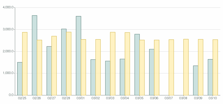
This is why the weight graph looks like it does, this is my calorie intake vs calories burned graph. Calories burned is made up of a base of approx 2,500 calories for my basic activity profile plus boosts to take into account the activity reports I’ve entered for when I go to the gym to do Olympic Weightlifting and/or Crossfit workouts
What really comes through on that chart, apart from the obvious excesses at the weekend (I neglected to enter figures for last weekend on this graph), is evidence that the Zone Diet is really a low calorie diet. A normal “good” zone day (during the week mostly) typically sees me come in at around 1,600 calories. That’s planning on around 14 – 17 blocks per day. It also nicely demonstrates just how good the zone diet plan is, as I can pretty much eat what I like at the weekend without putting weight on long term, as long as I’m good during the week. The big benefit here is this: I don’t need to feel guilty about that ice cream, chocolate or wine on a Saturday and Sunday.
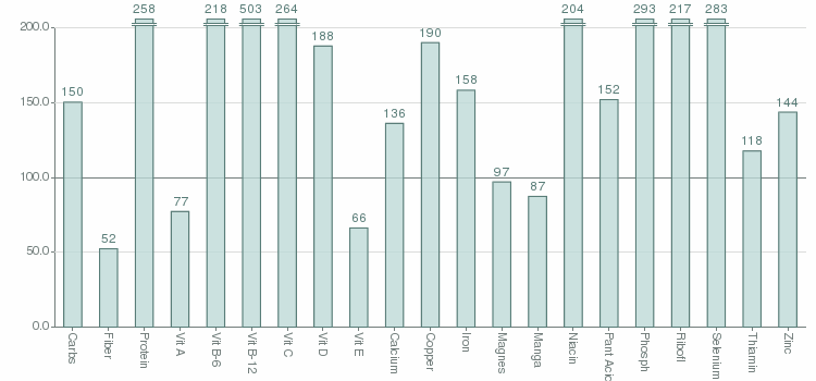
This is a very interesting chart too, it shows the cumulative nutritional make-up of my food, averaged per day and normalised to 100%. You can see then that anything that is below the 100 line is a deficiency:
You can see that the graph shows that for the vast majority of nutrients, zoning my food provides a huge slew of nutrients that I eat a sufficient amount of. However there are 3 areas I should look at: Fibre, Vitamin A and Vitamin E. I know that not eating much cereals would limit my fibre intake but must confess to being a little surprised at the vitamin A and E. This alternative view helps to quantify this by making your nutritional intake look like a food label, with actual values:
Long story short, I did some research into Vits A and E, and discovered that there is little consensus amongst the different health bodies in the US, UK and Europe, as to what these values should actually be. Vitamin A for example is 900mcg (0.9mg) in the US, but 700mcg (0.7mg) in the UK (I’m at 695). As a result, I’m not too bothered about being a bit down on the figures on fitday, however it did give me the focus to check it out. The fibre is possibly a bit more of a concern, I’ll have to look at ways of improving this.
Ultimately I’ve been quite impressed with fitday.com It’s a quick and simple system to use that provides an amazing wealth of information. I know for example that you can pay hundreds to have your nutrition analysed, whereas fitday gives it to you all for free. Or you can pay a small amount to use the software on your desktop rather than on the website, and also to get access to even more advanced reports and to sync your online and offline profiles. Altogether, I highly recommend fitday as a valuable tool in keeping fit and healthy.


